Print Competition FAQ: How to Prepare Images for Judged Prints
Preparing an image for a print competition is different from exporting a file for social media or even standard client delivery. Judged prints are viewed closely, and small issues in color, sharpness, tonal control, and file preparation can become much more noticeable on paper.
At Unique Photo, we recommend starting with the competition's published rules, then building a print workflow around accurate color management, restrained editing, and careful proofing. Whether you order test prints through our lab or produce your own on a professional printer, a disciplined approach can help your final submission look intentional and polished.
What color profile should I use for print competitions?
The best color profile is usually the one required by the competition or recommended by the printing workflow you are using. If a contest provides a specific color space for digital submissions or print-ready files, follow that instruction exactly. If they do not, many photographers edit in a wide-gamut working space and then convert to the output profile that matches the printer, paper, or lab requirement.
For competition prints, consistency matters more than guessing. Calibrate your monitor, soft-proof when possible, and avoid sending files with embedded profiles stripped out. If you are ordering a test print through the lab, creating a small proof first can help you evaluate whether your reds, skin tones, and shadow detail are reproducing the way you expect. A simple proof from the Unique Photo Lab 4x6 Print Glossy can be a practical first step before committing to a larger final print.
When you are ready to review presentation and detail at a more competition-relevant size, moving up to an 8x10 proof can reveal tonal transitions, sharpening artifacts, and color casts that may not be obvious on a smaller print.
How much sharpening is too much for a competition print?
Too much sharpening usually shows up as halos along edges, crunchy fine detail, exaggerated texture in skin or smooth surfaces, and an overall brittle look in the print. A file can appear impressively sharp on screen yet look harsh once printed, especially under gallery or judging lights.
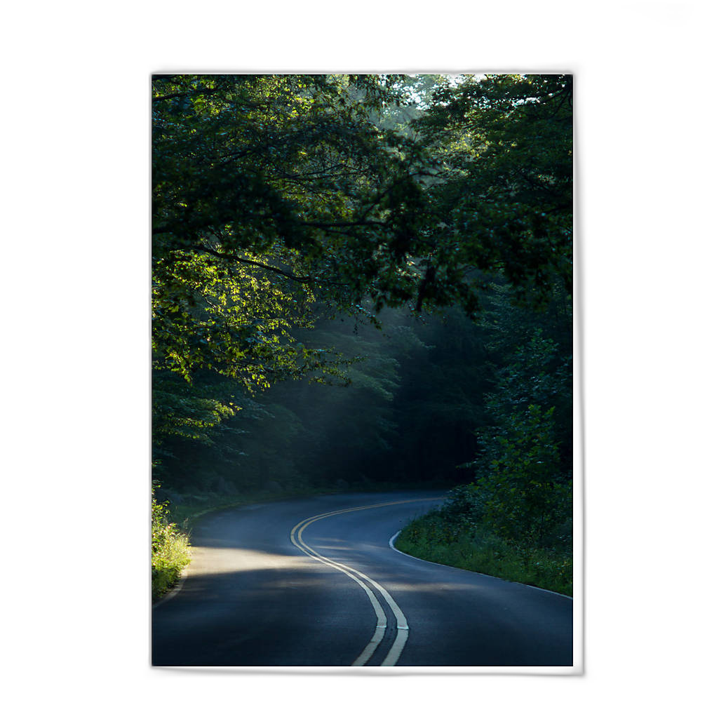
A better approach is to apply sharpening in stages: capture sharpening for the raw file, creative sharpening for the subject, and output sharpening tuned to the final print size. The larger the print, the more carefully you should evaluate edge contrast and micro-detail. View your image at realistic print magnification rather than relying only on 100% screen zoom. If you can see halos on screen, they will often become even more distracting in print.
Test prints are invaluable here. A small glossy proof can help you judge whether your detail enhancement looks crisp or overprocessed, while a larger proof gives you a truer sense of how the final presentation will read from normal viewing distance.
How much noise reduction is too much?
Excessive noise reduction is one of the fastest ways to make a competition print lose impact. When noise reduction is pushed too far, textures can become smeared, feather and hair detail can disappear, and backgrounds may take on a plastic or blotchy appearance. Judges often notice when an image looks unnaturally polished.
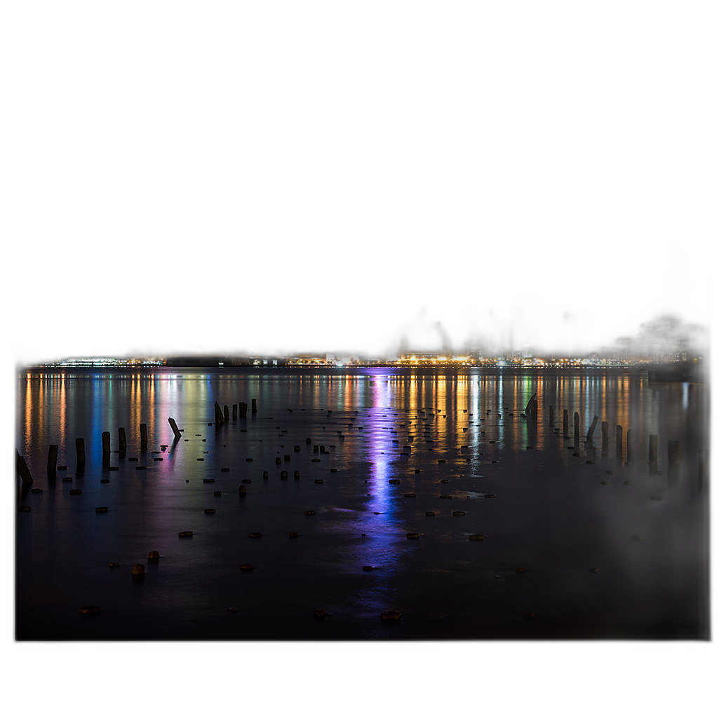
The goal is not to remove every trace of noise. Instead, preserve believable detail in the subject while controlling distracting grain in shadows and smooth tonal areas. Luminance noise is often more acceptable than waxy detail loss, particularly in fine art, wildlife, and low-light work. If the image was captured at a higher ISO, careful balancing is more important than aggressive cleanup.
Printing a proof is again the best reality check. Noise that looks obvious on a monitor may become negligible in print, while over-smoothing can remain visible and reduce the image's natural character.
What file format is best for print contest submissions?
Always defer to the competition guidelines first. If the contest asks for JPEG, submit a high-quality JPEG in the exact dimensions and color space requested. If TIFF is accepted for print production or exhibition files, it can be a strong choice because it preserves image quality with minimal compression concerns.
For physical prints produced through a lab, high-quality JPEG files are commonly sufficient when exported correctly. Make sure compression is not excessive, and keep your file cleanly prepared with the correct profile embedded. Avoid repeatedly re-saving JPEGs during editing. Complete your work in a layered or lossless master file, then export the final delivery file once.
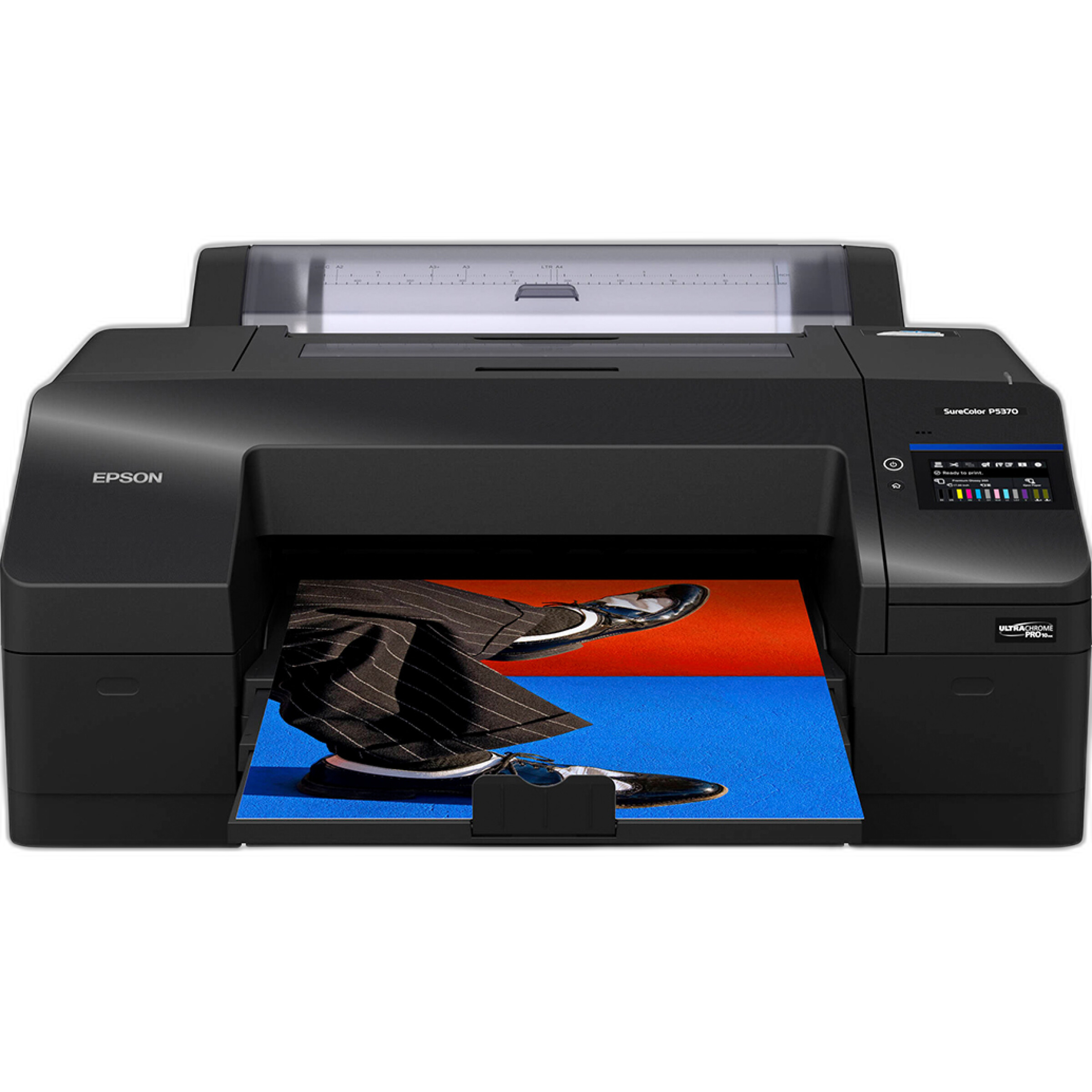
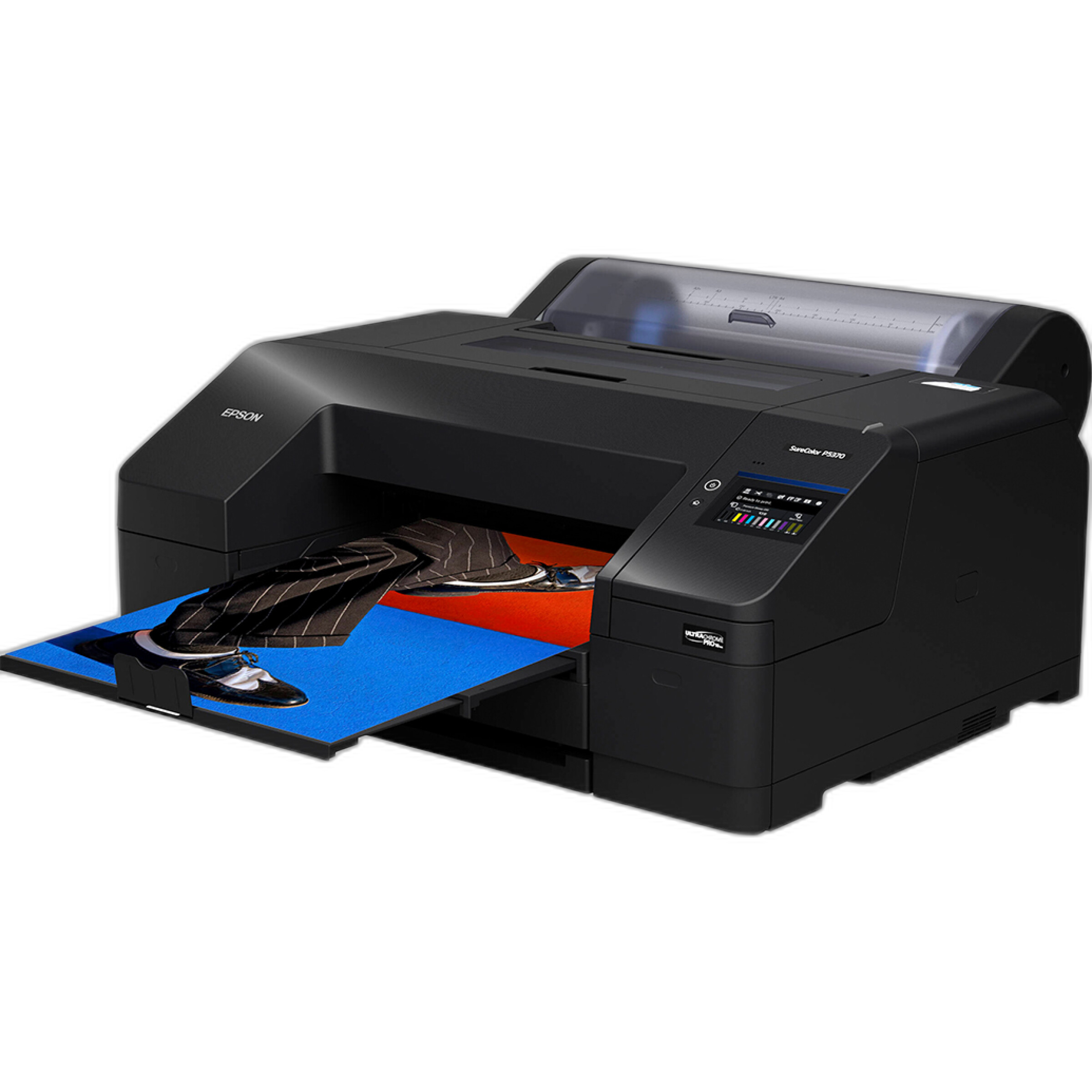
If you are printing in-house on a professional device such as the Epson SureColor P5370, you can maintain tight control over output settings, paper choice, and print driver management for exhibition-quality results.
What resolution should I use for competition prints?
In most cases, a resolution target around 240 to 300 pixels per inch at the final print size is a solid standard for photographic output. That does not mean every image must hit the exact same number to look good, but it is a dependable range for sharp, detailed prints. If a competition specifies file dimensions or print size, calculate your export accordingly.
Be cautious with unnecessary upscaling. Moderate resizing can work well, but exaggerated enlargement may introduce artifacts or produce detail that looks synthetic when inspected closely. If your file is marginal for the intended print size, make a proof before the final submission and evaluate whether the image still holds up.
For many photographers, producing both a small proof and an 8x10 review print is a practical way to confirm that the file has enough detail and tonal separation before moving to the exhibition print.
Should I print my own competition images or use a lab?
Both approaches can work well, depending on your experience, deadline, and need for control. A lab is a strong choice when you want repeatable quality, efficient turnaround, and access to proofing without maintaining a full print setup. Unique Photo lab prints are especially useful for testing edits before you finalize a competition submission.
Printing at home or in studio can be ideal if you want to fine-tune every variable yourself. A professional printer like the Epson SureColor P5370 offers the level of control serious printmakers value for color-critical work and larger exhibition pieces.
If you work in a Canon printing ecosystem, keeping fresh consumables on hand is equally important for consistency. Reliable ink performance helps preserve smooth gradients and accurate color, especially in difficult hues that can shift visibly in print.
How do I make sure the print matches what I see on screen?
Start with a calibrated, reasonably bright monitor. Displays that are too bright often cause photographers to create prints that come out darker than expected. Soft-proofing with the intended output profile can help preview gamut limitations and tonal changes before you export or print.
Next, review the image specifically for paper. Prints usually show contrast, saturation, and shadow detail differently than backlit screens. Small adjustments to black point, midtone contrast, or saturation can make a meaningful difference. The safest workflow is to create a proof, inspect it under neutral lighting, make targeted changes, and then produce the final version.
This is where smaller lab proofs are especially helpful: they let you catch issues early without spending time and money on full-size reprints.
What common mistakes hurt competition prints the most?
The most common problems are oversharpening, overdone noise reduction, muddy shadows, clipped highlights, inaccurate color, and ignoring the contest's technical requirements. Another frequent issue is editing for screen impact rather than print quality. Very deep blacks, extremely saturated colors, and heavy local contrast can feel dramatic on a monitor but look less refined on paper.
Presentation matters too. Check for dust spots, edge distractions, unintended color casts, and uneven tonal transitions. Read the rules carefully for mounting, borders, naming conventions, and accepted file formats. Even a strong image can be undermined by preventable technical errors.
If you rely on your own printing equipment for competition deadlines, protecting that investment can also be worthwhile. Service coverage options such as Canon CarePAK PLUS plans can be relevant for eligible printer owners who want added peace of mind around their hardware.

What is the best final workflow before I submit?
Use a checklist. Confirm the contest rules, verify the required color space, export the correct file format and dimensions, inspect the image at print size, soft-proof if possible, and make at least one physical proof. Then review the print under appropriate lighting and look for color balance, sharpness, shadow detail, and any retouching artifacts.
If you are printing in-house, run a nozzle and maintenance check, use the correct paper settings, and confirm that your ink and printer are ready for consistent output. If you are working with a lab, allow enough time for proofing and revisions rather than placing your final order at the last minute.
A great competition print is rarely accidental. It usually comes from a careful, repeatable workflow that respects both the image and the medium. If you are preparing for an upcoming submission, Unique Photo can help with proof prints, larger photo prints, printers, and essential printing supplies so you can send in your best possible work.