Few names in photography carry the historical weight of Kodak. For generations of photographers, Kodak film has not simply been a recording medium; it has been the visual language of family snapshots, editorial assignments, fashion portraits, landscapes, darkroom prints, and projected slides. By the late 1990s, Kodak’s catalog had already become a map of photographic practice itself, spanning color negative, black-and-white, and reversal film for nearly every kind of camera and every kind of light.
This guide is designed as a historical hub: a chronological orientation to the Kodak film families that have shaped photographic work and popular memory, from enduring black-and-white emulsions like Tri-X to consumer staples like Gold, professional portrait materials like Portra, and high-saturation color films such as Ektar. While today’s film shooters may encounter these names as classics, each stock emerged in response to very practical needs: better skin tones, finer grain, more exposure latitude, stronger color, improved scanning, easier lab printing, or a look photographers simply refused to give up.
What follows is not a shopping list so much as a lineage. We will trace how Kodak’s film offerings developed across black-and-white, color negative, and reversal categories, and why certain names endured long enough to become standards. For photographers revisiting film—or discovering it for the first time—understanding the family tree helps explain why these emulsions still matter.
Kodak’s Film World: Three Broad Families
Before looking at individual stocks, it helps to understand the three broad types represented in Kodak’s photographic film line: color negative, black-and-white, and reversal film.
Color negative film
Color negative film produces an orange-masked negative designed to be printed onto color photographic paper or, increasingly by the late 1990s, scanned for digital output. Its great strength has long been exposure latitude. In practical use, color negative film tends to be forgiving, especially in mixed light or high-contrast scenes, making it the most versatile category for portraiture, weddings, travel, and everyday photography. Many of Kodak’s best-known films—including Gold, Portra, and Ektar—belong to this family.
Black-and-white film
Black-and-white remains the most direct link to photography’s older traditions, but it is hardly a relic. Kodak black-and-white films have long been prized for tonal separation, grain structure, processing flexibility, and darkroom character. Some photographers choose black-and-white because it removes the distraction of color; others rely on it because specific emulsions respond beautifully to pushing, available light, and expressive printing techniques. Tri-X stands at the center of this tradition.
Reversal film
Reversal, or slide film, produces a positive image on the film itself. Its appeal is immediate and vivid: what you see on the light table or projected on a screen is the final transparency. Historically, reversal film has been preferred for projection, publication workflows, and situations where brilliant color and crisp rendering are paramount. The tradeoff, compared with color negative film, is generally tighter exposure tolerance. Kodak’s Ektachrome and Kodachrome families are the landmarks here.
Early Foundations: Kodak and the Democratization of Film
Kodak’s broader significance begins well before any single emulsion family. The company’s historical role in popular photography rests on its ability to simplify picture-making for ordinary users while also creating specialized products for demanding professionals. Roll film transformed the camera from a technical instrument into an everyday device. Over time, Kodak expanded from serving the amateur snapshot market into cinema, press, scientific, and professional still photography, and with that expansion came a steadily more segmented film line.
By the mid-20th century, Kodak was not making one “Kodak film” but many Kodaks: films for daylight, tungsten, fine grain, speed, portraits, landscapes, projection, lab efficiency, and enlargements. This diversity matters because the famous names photographers still seek out today did not appear in isolation. Each inherited lessons from earlier emulsions and was shaped by evolving expectations in cameras, lenses, minilabs, pro labs, and publication workflows.
Tri-X and the Black-and-White Tradition
No Kodak film name is more deeply woven into photographic history than Tri-X. Introduced in the 20th century as a fast black-and-white emulsion, Tri-X became synonymous with available-light photography, reportage, street work, and an expressive grain structure that never felt merely technical. It was the film of newsrooms, documentary projects, jazz clubs, city streets, and darkrooms where photographers learned to push development and print with intention.
What made Tri-X so important was not just speed, but freedom. Faster black-and-white film allowed photographers to work in lower light, use smaller apertures, and capture life as it unfolded rather than constructing every frame around a tripod and bright sun. In practical terms, that meant more candid portraiture, more handheld work, and more immediacy. In aesthetic terms, Tri-X helped define the visual texture of postwar documentary photography.
As Kodak refined black-and-white emulsions over the decades, photographers continued to value Tri-X for its familiar tonal curve and forgiving nature. It tolerated real-world shooting conditions. It rewarded confident development. It printed well. And unlike attempts to make every film clinically fine-grained, Tri-X retained a grain pattern that many photographers regarded as part of the picture rather than a defect. Even as newer films offered different balances of sharpness and smoothness, Tri-X endured because its look remained culturally meaningful.
In any Kodak hub, Tri-X belongs near the beginning not because it is old, but because it established a pattern Kodak would follow repeatedly: identify a practical need, answer it with a technical solution, and then discover that photographers also care about the emotional signature of the material. The best Kodak films have always succeeded on both counts.
Kodachrome, Ektachrome, and the Rise of Reversal Film
If Tri-X defined one branch of Kodak’s black-and-white identity, Kodachrome and Ektachrome defined color transparency for generations. For much of the 20th century, slide film represented the most immediate and convincing form of color photography. A well-exposed transparency on a light box possessed clarity and brilliance that made prints seem secondary. Publishers valued transparencies, lecturers projected them, and serious amateurs treasured them as finished originals.
Kodachrome’s distinct place
Kodachrome occupies a singular place in photographic history. It became famous not only for color but for a particular richness and archival reputation that made it beloved among travel, editorial, and documentary photographers. Its processing requirements were highly specialized, and that specialization was both part of its mystique and part of the challenge. Kodachrome was never simply convenient. It was a commitment to a process and a look.
By the late 20th century, however, the photographic world increasingly valued speed of turnaround and flexible lab access. That broader shift opened more room for other transparency materials.
Ektachrome’s role in a changing workflow
Ektachrome represented Kodak’s other major reversal lineage and became especially important as photographers demanded professional color transparency with more accessible processing and a range of applications. Ektachrome stocks evolved through multiple generations as Kodak pursued finer grain, improved color balance, and better suitability for editorial and commercial use. For many photographers, Ektachrome was the practical transparency film: vivid, professional, and integrated into fast-moving workflows.
As the 1990s unfolded, reversal film still held a strong place in publication, projection, and commercial photography, but the balance was beginning to change. Color negative films were improving dramatically in grain, color accuracy, and printability. At the same time, scanning workflows were becoming more relevant. That set the stage for Kodak’s next major developments.
Gold and the Consumer Color Negative Revolution
For many photographers and families, the Kodak story is not first about press cameras or slide projectors. It is about consumer color negative film—and within that world, Gold became one of the defining names. Kodak Gold represented the maturation of everyday color film into a dependable, mass-market standard for snapshots, vacations, birthdays, school events, and casual travel. It was built for wide accessibility and broad appeal, but that should not obscure its technical importance.
Consumer color negative films had to solve a very difficult problem: they needed to look good in countless uncontrolled situations and print well through enormous lab networks. Gold succeeded because it balanced speed, pleasing color, and user-friendly exposure latitude. In practical terms, it delivered the warmth and familiarity many people associate with the “film look” of the late 20th century. Skin tones could be inviting, daylight scenes had attractive color, and prints from minilabs retained a distinctly Kodak character.
Gold also illustrates Kodak’s strength in segmentation. A company could not serve both professionals and casual users with the exact same emulsion philosophy. Consumer films had to be robust and broadly flattering. Professional films could afford to be more specialized. Gold’s success helped normalize color negative photography as the everyday default, which in turn prepared the market to appreciate more advanced professional negative films later on.
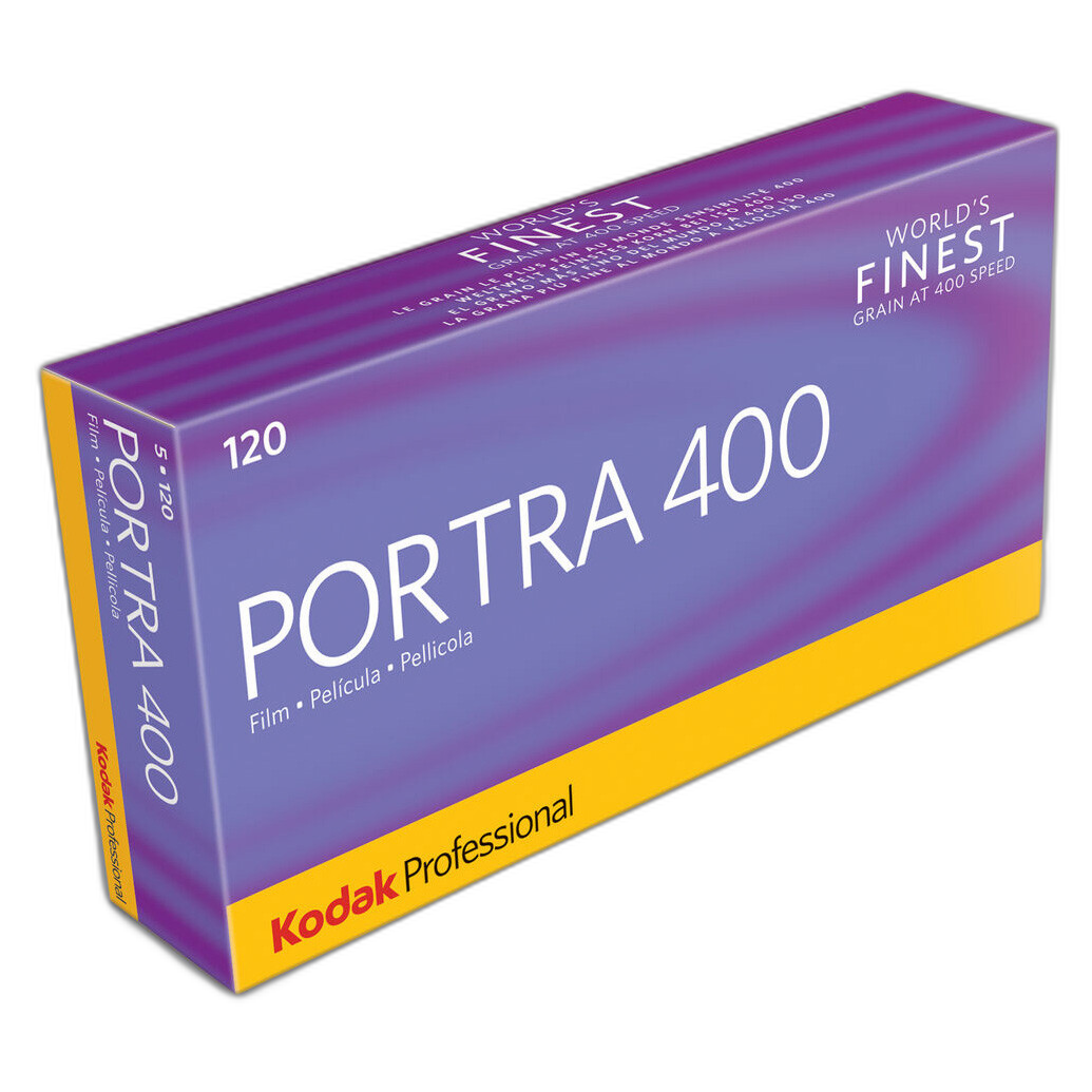
The Professional Turn: Why Portra Mattered
By the 1990s, Kodak’s professional color negative line had become a critical area of innovation. Portrait and wedding photographers needed more than generic color. They needed films tailored to skin tones, studio strobes, location work, enlargements, and the increasingly exacting expectations of clients and labs. That need gave rise to the Portra family, one of Kodak’s most significant professional film introductions of the era.
Portra was conceived as a portrait-oriented color negative line, and the name itself signaled Kodak’s intent. These films were designed around the realities of photographing people: natural-looking skin, smooth tonal transitions, controlled saturation, and the latitude required for difficult lighting situations. Where some color films chased spectacle, Portra pursued credibility and grace.
Why Portra was an advance
The key achievement of Portra was not a single headline feature but an overall refinement of the professional negative workflow. Earlier professional color films had already served portraiture, but Portra represented Kodak’s effort to unify improvements in grain, color rendition, and print consistency into a family clearly aimed at portrait specialists. It acknowledged that professional labs, wedding studios, school portrait operations, and editorial portrait photographers all valued reliability as much as visual beauty.
Portra also arrived at an important moment. By the late 1990s, photographers were increasingly thinking about hybrid workflows. Even when final output remained optical printing, the future was beginning to suggest digital intervention. A film with smooth tones and flexible negatives had advantages not only in the enlarger but in scanning and file adjustment. Though written from a release-period perspective, it is easy to see historically why Portra would become one of Kodak’s most enduring names: it was built around the negative itself as a versatile information-rich original.
The Portra look
Portra’s reputation grew around color that did not call attention to itself in the wrong ways. Skin tones appeared believable rather than exaggerated. Contrast remained manageable. The image invited interpretation in printing, which is exactly what many professionals wanted. This was less about immediate punch than about elegant control. That distinction is crucial in understanding Kodak’s lineup. Not every great film aims to dazzle at first glance; some become indispensable because they leave room for the photographer and lab to shape the final result.
Ektar: Saturation, Fineness, and the Pursuit of Color Detail
If Portra became Kodak’s shorthand for nuanced portrait color, Ektar belongs to another branch of the family tree: films associated with vivid color, fine grain, and a more assertive palette. Historically, the Ektar name has been used by Kodak in different contexts, but in the broad popular memory of still photography it signifies Kodak’s ongoing pursuit of richly colored, highly resolved negative film suited to subjects that benefit from clarity and saturation.
Why did a film like Ektar matter in the Kodak ecosystem? Because not every photographer wanted the same rendering from a color negative. Landscapes, travel scenes, graphic subjects, and commercial images often benefit from stronger color separation and a sense of crispness. Kodak’s challenge was to offer that kind of look without abandoning the convenience and latitude of negative film. In that sense, Ektar speaks to a larger trend in Kodak’s history: color negative technology became refined enough to compete in areas once strongly associated with transparency film.
That development is one of the major stories of late-20th-century film. As grain improved and labs became more sophisticated, color negative stocks could satisfy photographers who once might have defaulted to slides for vividness or detail. Ektar, as a name and concept, belongs to that narrative of negative film growing more ambitious.
How Kodak’s Generations Improved Over Time
Across these families—Tri-X, Gold, Portra, Ektachrome, Ektar—the central historical pattern is one of progressive refinement rather than abrupt reinvention. Kodak’s generations typically advanced in a handful of recurring ways.
Finer grain
One of the most visible measures of film progress has always been grain. As emulsions improved, photographers gained cleaner enlargements and smoother tonal transitions. This mattered to professionals producing large prints, but it also mattered to ordinary users who wanted sharper-looking snapshots from compact cameras and one-hour labs.
Better color rendition
Kodak spent decades refining color reproduction, especially in the difficult area of skin tones. A technically “accurate” film is not always a visually pleasing one; the art of film design lies in shaping color so that prints and transparencies feel believable, flattering, and consistent under practical conditions. Portra is a prime example, but even consumer stocks like Gold reveal this long pursuit of pleasing color.
Improved exposure latitude
Particularly in color negative film, latitude became a major selling point. The more gracefully a film handled overexposure or challenging contrast, the more useful it became for real assignments and casual photography alike. This was one reason negative films steadily broadened their appeal relative to reversal stocks.
Workflow compatibility
Film never exists in isolation. It must be processed, printed, mounted, archived, or scanned. Kodak’s successful generations tended to align with the workflows of their time. Consumer films had to suit high-volume minilabs; professional portrait films had to integrate with pro lab printing; transparency films had to satisfy editorial and projection workflows. By the late 1990s, scan-friendliness was beginning to matter more as well.
Why Some Kodak Stocks Endured While Others Faded
A historical hub should also explain why some names remain culturally alive while others become footnotes. Endurance in film usually comes from a mix of technical excellence, market timing, and a distinctive visual identity.
Tri-X endured because it was both useful and iconic. Gold endured because it became part of everyday life. Portra endured because professionals found it dependable and flexible. Ektachrome endured because transparency photography retained serious applications and devoted users. Ektar endured because saturated, fine-grained color negative film occupies a special place between realism and spectacle.
Not every Kodak film could maintain such a place. Some were superseded by better emulsions. Some belonged to processing systems that declined. Some served narrow markets that shrank. Film history is full of technically interesting stocks that lost their relevance when labs, publication practices, or user habits changed. The survivors are usually the ones that solved practical problems while also offering a recognizable aesthetic reward.
Reading the Kodak Line in the Late 1990s
Viewed from around the 1998 period, Kodak’s photographic film range presents a fascinating moment of overlap between mature analog practice and an emerging digital future. Film technology is highly evolved. Professional and consumer users can choose from specialized materials with confidence. Labs are efficient. Color negative quality is strong enough to challenge old assumptions about what only slide film can do. Black-and-white remains artistically vital. And yet digital imaging is beginning to reshape expectations, especially in scanning, output flexibility, and turnaround.
In that environment, Kodak’s major film families make clear sense. Gold serves the broad snapshot market. Tri-X anchors black-and-white tradition and expressive reportage. Ektachrome continues the transparency lineage for those who need or love slide film. Portra addresses the nuanced needs of portrait and wedding professionals. Ektar represents the ongoing desire for color intensity and refined detail within the negative-film domain. Together they show Kodak not as a maker of one look, but as a curator of many photographic possibilities.
How to Think About Kodak Film Historically Today
For contemporary film photographers, it can be tempting to approach Kodak stocks only in terms of internet shorthand: Portra for pastel portraits, Tri-X for gritty monochrome, Gold for nostalgic warmth, Ektar for saturated landscapes. Those descriptions are not entirely wrong, but they flatten the history. Each of these films emerged from specific technical and commercial needs, and each reflects Kodak’s long effort to balance chemistry, optics, lab practice, and photographer taste.
That historical perspective makes shooting film more meaningful. When you load Tri-X, you are engaging with the black-and-white language of reportage and darkroom interpretation. When you load Gold, you are working with a descendant of the great democratization of color snapshots. When you load Portra, you are stepping into a professional portrait lineage built around subtle skin and printable negatives. When you choose Ektachrome or another reversal stock, you are embracing the discipline and immediacy of the transparency tradition. And when you choose Ektar, you are tapping into Kodak’s ambition to give negative film extraordinary color presence.
Conclusion
Kodak film history is best understood not as a list of isolated products but as an evolving ecosystem of photographic solutions. From black-and-white mainstays to consumer color negatives, from portrait specialists to vivid transparency materials, Kodak continually refined its emulsions to meet the changing needs of photographers. Tri-X, Gold, Portra, Ektar, and the broader Ektachrome lineage endure because they each represent a successful answer to a real photographic problem—and because they each carry a visual identity strong enough to outlast their original era.
For photographers exploring film’s past or choosing a stock with a clearer sense of its heritage, this lineage remains invaluable. And for those looking to buy Kodak film or learn more about the cameras, chemistry, and workflows that surround it, Unique Photo remains an excellent place to shop, ask questions, and continue the conversation.