Fujifilm’s place in photographic history is not defined by a single emulsion, but by a lineage. Across color reversal and color negative film, the company built a family of stocks that photographers came to recognize not just by speed or format, but by character: the saturated punch of Velvia, the balanced versatility of Provia, the smooth portrait rendering associated with the professional negative films, and the broader house style that helped establish Fujifilm as a serious rival in the global film market.
This guide is a historical hub to that lineage. Rather than treating each stock as an isolated product, it follows Fujifilm film chronologically and practically, tracing how one generation informed the next. The story is especially important because Fujifilm did not merely add more film names to the shelf; it refined a philosophy of color, grain, contrast, and intended use. For landscape photographers, editorial shooters, portrait specialists, lab technicians, and serious enthusiasts, these films became tools with distinct identities.
What follows is an archival overview centered on Fujifilm photographic film as a category spanning color reversal and color negative materials. It is written in the spirit of the era in which many of these films emerged, when transparency film still held enormous prestige, professional minilabs shaped the look of consumer imagery, and choosing an emulsion was one of the most consequential creative decisions a photographer made before ever pressing the shutter.
Fujifilm’s Film Identity in Context
By the late twentieth century, Fujifilm had become one of the major names in analog photography. To understand the significance of Velvia, Provia, and later Pro 400H, it helps to remember that photographers once lived in a world where film choice shaped nearly everything. Color palette, grain structure, contrast, dynamic response, scanning behavior, printability, and perceived sharpness all began with the emulsion.
Fujifilm’s film catalog grew to address different needs, but it also displayed a recognizable approach. The company became especially admired for clean color separation, a modern look in transparency materials, and professional negative films that could handle portraiture and mixed lighting with an attractive balance of realism and style. Unlike a purely technical specification sheet, the reputation of these films was built in the field: mountain light at dawn, wedding receptions under difficult illumination, studio portrait sessions, magazine features, travel reportage, and commercial work destined for publication.
This dual strength in both reversal and negative film is central to Fujifilm’s importance. Reversal stocks supplied the exacting brilliance needed for projection, editorial submission, and drum scanning. Negative stocks served photographers who valued exposure latitude, nuanced skin tones, and flexible printing. Fujifilm did not ask the market to choose between technical seriousness and expressive image-making; it aimed to offer both.
The Foundation: Color Reversal and Color Negative as Two Different Languages
Before moving through the timeline, it is worth separating the two major branches of the Fujifilm family referenced here.
Color reversal film
Color reversal, often called slide or transparency film, produces a positive image on the film itself after processing. It became a preferred medium for many professionals because it offered a direct and highly legible original. Editors, art directors, and photographers could place a transparency on a light table and judge color, sharpness, and exposure immediately. Reversal film was also known for vivid color, high apparent sharpness, and a more demanding exposure discipline than negative film.
For Fujifilm, the reversal side of the family would become home to some of its most famous names, particularly Velvia and Provia. These films were not interchangeable. One became synonymous with intense saturation and landscape drama; the other with a more balanced and versatile transparency look suited to a broader range of subjects.
Color negative film
Color negative film produces an inverted image that is then printed or scanned to a positive. In practical use, negative film traditionally offered greater exposure latitude and more forgiving handling than transparency film. This made it deeply attractive for portrait, wedding, and commercial photographers who needed flexibility without sacrificing professional quality.
Fujifilm’s negative films ultimately developed a devoted following for their color rendering and smooth, flattering tonality. Within that branch, later emulsions like Pro 400H would stand out for the way they interpreted skin, highlights, and ambient color in real-world professional work.
Early Professional Ambition: Fujifilm Establishes a Serious Presence
Long before one stock came to dominate conversation, Fujifilm had already been building the credibility necessary to compete in demanding photographic circles. The company’s broader film effort demonstrated that it understood the segmentation of the market: professionals and enthusiasts needed films tailored not simply by speed, but by subject matter and workflow.
In practical terms, that meant the emergence of films designed for accuracy, consistency, and intended application. Transparency users wanted dependable color and fine grain. Portrait photographers wanted skin tones that did not turn artificial under pressure. Commercial users wanted materials that reproduced well in print and held together in scanning and duplication. Laboratories wanted processing behavior they could trust. Fujifilm’s progress across these fronts laid the groundwork for the breakout status of the films that would later define the brand in public memory.
What made Fujifilm notable was that it did not only pursue neutrality. It also recognized that photographers often wanted a look. The art of film design, after all, lives in the controlled shaping of color and contrast. The company’s lineup increasingly reflected that awareness: some stocks were built to be vivid and dramatic, while others prioritized balance and flexibility. This product differentiation became one of the key reasons photographers could build an entire working method around the Fujifilm system.
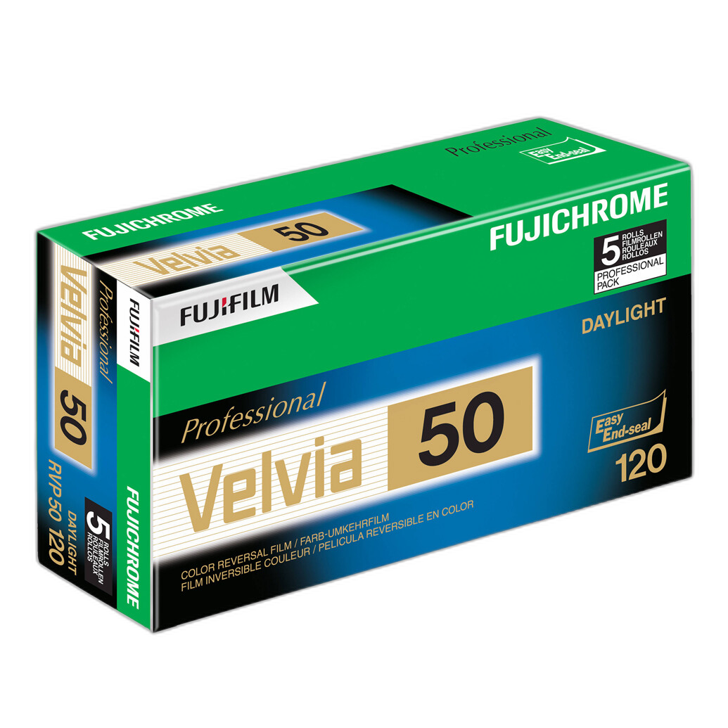
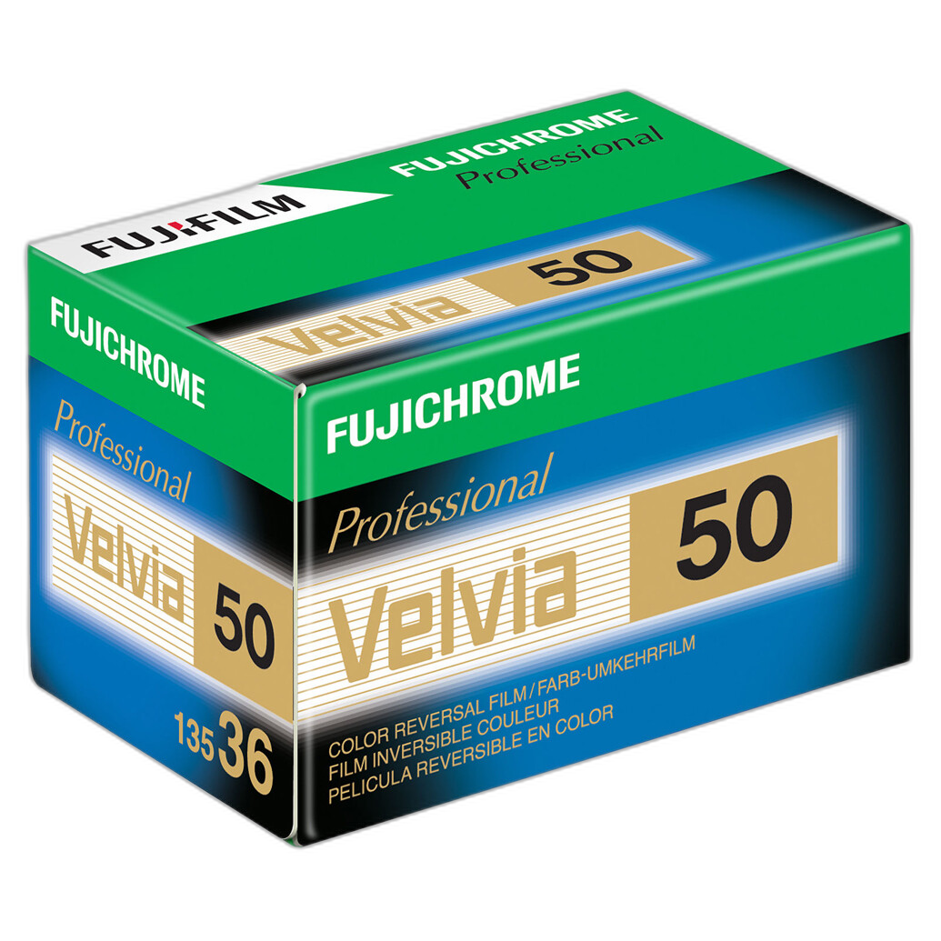
Velvia: The Stock That Became a Visual Shorthand
Few films in photographic history have become as culturally recognizable as Fujifilm Velvia. Its name grew beyond the box and into the language of photographers themselves. To call a picture “Velvia-like” was to invoke a specific visual impression: lush saturation, rich color, heightened landscape appeal, and an image that seemed to leap from the light table.
Velvia’s significance lies in how clearly it addressed a desire in the market. Landscape and nature photographers in particular gravitated to a transparency film that delivered intense color and high visual impact. Greens, blues, reds, and warm dawn or dusk light could take on extraordinary presence. In an era when publication, stock photography, slide projection, and large display all mattered, that presence had commercial and aesthetic value.
Chronologically, Velvia represented more than a new product name. It marked a maturation of Fujifilm’s confidence in giving photographers a strongly differentiated creative tool. Rather than aiming for a generic professional transparency, Velvia embraced a distinctive rendering. That decision mattered. It proved that a film could be technically respected and stylistically assertive at the same time.
Why Velvia mattered
The importance of Velvia was not just its saturation, though that is what most people remember first. It was also about consistency of effect. Photographers learned how it behaved and began composing with its strengths in mind. Autumn foliage, alpine vistas, seascapes, desert light, wildflowers, and travel imagery all took on a heightened intensity. The film rewarded subjects with strong color relationships and deliberate exposure.
In this sense, Velvia changed practice as much as perception. Users often metered carefully, sought quality light, and selected scenes that would allow the emulsion to do what it did best. The result was a feedback loop between material and vision: the film shaped the kind of picture people set out to make.
Velvia in the broader Fujifilm lineage
Within the Fujifilm family, Velvia demonstrated that the company could lead rather than merely participate. It gave the brand a flagship look. Even photographers who preferred other films had to reckon with its influence, because it raised expectations about what a modern color reversal stock could deliver in terms of impact and identity.
That influence would also help frame the role of subsequent films. Once Velvia existed as the high-saturation benchmark, Fujifilm had even more reason to offer a complementary transparency for photographers seeking a calmer and more general-purpose response. This is where Provia enters the story.
Provia: The Balanced Professional Counterpart
If Velvia became the dramatic voice in Fujifilm’s reversal family, Provia became the disciplined one. It represented a different interpretation of professional transparency film: balanced, broadly useful, and suited to photographers who wanted color fidelity and versatility without the pronounced saturation profile associated with Velvia.
This distinction is what made Provia so important in the release history. A mature film lineup cannot thrive on extremes alone. Many professional assignments require a stock that behaves predictably across portraiture, travel, editorial, still life, and mixed subject matter. Provia answered that need by giving users a transparency option that sat in a more neutral or moderate position within the Fujifilm aesthetic spectrum.
How Provia advanced the lineup
Provia’s advancement was strategic as much as technical. It helped Fujifilm define a two-part transparency identity. On one side stood Velvia, beloved for visual drama. On the other stood Provia, valued for flexibility. This made the brand’s reversal range more coherent and easier for photographers to navigate.
For working professionals, that coherence was no small advantage. It meant one could remain within the Fujifilm ecosystem while choosing the rendering that best fit the assignment. A landscape portfolio might call for Velvia. A broad editorial job with uncertain lighting and varied content might favor Provia. Instead of a one-film-fits-all approach, Fujifilm offered a choice of visual temperament.
Provia’s role on the light table
In practical use, Provia earned respect as a stock that could travel widely across genres. It appealed to photographers who wanted the crisp, polished qualities of slide film but preferred not to push every subject toward maximum chroma. This made it especially valuable in circumstances where realistic color relationships mattered, or where the subject itself carried enough visual strength without additional embellishment from the emulsion.
The contrast between Velvia and Provia also helped educate generations of photographers. It taught users to think critically about film not just as a recording medium, but as an interpretive medium. The question was no longer simply, “What speed do I need?” It was, “How do I want color to feel?”
The Negative Side of the Family: Toward a Portrait and Professional Print Aesthetic
While Fujifilm’s transparency films often captured the most visible headlines, the company’s color negative lineage is equally important to understanding its overall contribution. Many professionals worked in negative film for the simple reason that assignment realities demanded latitude, print flexibility, and strong performance in less-than-ideal lighting conditions.
Negative film is where a manufacturer’s understanding of skin, tonal transitions, and printing practice becomes particularly evident. Portrait and wedding photographers, in particular, are quick to notice whether a film handles complexion gracefully, whether highlights stay elegant, and whether mixed sources of color remain believable rather than distracting. Fujifilm built a strong reputation in precisely these areas.
Across the development of its professional negative films, Fujifilm refined a look that many users found modern but flattering. This part of the family set the stage for one of the later and most beloved names in the catalog: Pro 400H.
Pro 400H: A Later Professional Favorite with Distinctive Appeal
Though it arrived after the era that first made Velvia and Provia famous, Fujifilm Pro 400H deserves a central place in any historical guide to the company’s defining stocks. It became one of the most discussed and fondly remembered professional color negative films in the Fujifilm lineup, particularly among portrait, wedding, and lifestyle photographers.
Its importance lies in the way it extended Fujifilm’s identity into a different working method. If Velvia represented controlled, high-impact transparency practice and Provia embodied balanced slide versatility, Pro 400H spoke to the needs of photographers who wanted negative-film flexibility paired with a recognizable color signature. It was embraced for the way it rendered scenes with softness where needed, openness in highlights, and a palette that many users considered both flattering and expressive.
Why Pro 400H stood out
Professional negative films often develop loyal followings because they become woven into the rhythm of real assignments. Pro 400H earned that loyalty through usability as much as appearance. It fit naturally into portrait sessions, weddings, daylight location work, and mixed-light environments where photographers wanted room to maneuver in exposure and printing or scanning.
Just as importantly, it gave the Fujifilm lineage a strong anchor in the color negative conversation. This matters historically because it prevents the company’s film legacy from being reduced to transparency film alone. Fujifilm was not simply the maker of a famous landscape slide stock; it was also a builder of professional negative emulsions that shaped the visual culture of portrait and event photography.
Pro 400H in relation to the older Fujifilm tradition
Seen from a release-history perspective, Pro 400H can be understood as an inheritor of Fujifilm’s broader strengths. It continued the company’s emphasis on a distinct color personality while serving practical professional needs. In that sense, it carried forward the same logic that made the earlier lineup successful: do not offer generic film where a clearly defined and useful rendering can better serve photographers.
How the Generations Advanced
Looking across the chronology, Fujifilm’s film family advanced along several connected lines.
From competence to character
Early success required technical reliability, but the films that endure in memory are the ones with character. Fujifilm’s major advances involved sharpening the identities of its products so photographers could choose an emulsion based on intended visual outcome, not just processing compatibility or price.
From broad categories to specialized creative tools
The evolution from general professional film offerings to clearly differentiated names like Velvia, Provia, and Pro 400H reflects a maturing market. Fujifilm responded by turning film selection into a finer-grained creative decision. Landscape, editorial, portrait, and wedding photographers increasingly had stocks that felt purpose-built.
From the light table era to scanning-era relevance
Although many of these films were born in a world dominated by projection, publication, and optical printing, their reputations survived into the scanning era because their core characteristics remained desirable. Velvia still scanned like Velvia. Provia still offered balanced transparency color. Pro 400H still gave portrait shooters the tonal behavior they loved. The lineage proved adaptable because the films had strong visual identities to begin with.
Choosing Among the Fujifilm Looks
For photographers encountering this history as a guide, the easiest way to orient the lineup is by asking what kind of image you want to make.
Choose the Velvia tradition if your priority is dramatic color, landscape intensity, and an unmistakable transparency-film signature. This branch of the family is the one most associated with visual boldness.
Choose the Provia tradition if you want the discipline and directness of color reversal film with a more balanced rendering suited to a wide range of professional subjects.
Choose the Pro 400H tradition if your interests lie in portraiture, weddings, or situations where color negative flexibility and a flattering professional look matter most.
These are not rigid rules, of course. Great photographers have always used films against type. But the strength of the Fujifilm lineage is that each of these names became meaningful shorthand for a style of seeing.
Why Fujifilm Film Still Matters Historically
The continuing fascination with Fujifilm film is about more than nostalgia. These stocks matter because they helped define the visual expectations of their eras. Editors reviewed transparencies shaped by them. Stock libraries were filled with them. Wedding albums, portrait sessions, travel stories, and landscape portfolios were built on them. Even today, digital photographers often reference these films when describing color they admire.
That enduring relevance also comes from the fact that the films were not all trying to do the same thing. Fujifilm’s catalog became historically important because it offered a spectrum of purposeful choices within the broad field of color photography. Its reversal and negative films each developed champions, and some names became near-mythic because they answered creative needs so directly.
In the end, the lineage from Fujifilm’s professional film ambitions to landmark names like Velvia, Provia, and Pro 400H tells a larger story about photography itself. It reminds us that for much of modern image-making, the medium was never transparent in the philosophical sense. Film always participated in the picture. It interpreted. It leaned. It emphasized. And Fujifilm, more than many manufacturers, understood how to turn that interpretive role into a family of products photographers could love, trust, and debate for decades.
Conclusion
Fujifilm photographic film remains one of the most influential families in analog history, spanning both color reversal and color negative materials with uncommon distinction. Velvia gave photographers a vivid visual signature. Provia supplied a balanced professional transparency option. Pro 400H carried the company’s identity into a beloved negative-film workflow. Together, they form not just a product list, but a map of how Fujifilm built a look and then expanded it across generations.
For photographers, collectors, and students of camera history, understanding this lineage is essential to understanding late-film-era image culture itself. To explore more photographic history, discover film-related gear, or learn more about the analog traditions that shaped modern image-making, visit Unique Photo.