How to Prepare Photos for Print Competitions
Entering a print-based photography competition requires a different mindset than preparing files for screens. In print, every decision becomes physical and visible, from tonal transitions and paper surface to matting, handling, and final presentation.
At Unique Photo, we regularly help photographers refine images for exhibition, judging, and portfolio review. This FAQ covers the most important considerations so your printed work looks polished, intentional, and competition-ready.
What is the biggest difference between preparing an image for print versus digital competition?
The biggest difference is that a print has a fixed physical presence. Screen images are backlit, often brighter, and viewed on displays with varying calibration. A print reflects ambient light, reveals texture, and is judged not only on the photograph itself but also on how successfully the file translates to paper. That means sharpening, contrast, shadow detail, highlight control, and color balance often need to be adjusted specifically for output.
For print competitions, it is wise to soft-proof your file, evaluate it at the intended print size, and make careful local adjustments instead of relying on a version that looked great online. Fine detail, skin tones, deep blacks, and subtle gradients can behave very differently once ink meets paper.
How should I adjust brightness and contrast so my print does not come out too dark?
This is one of the most common print-preparation issues. Because monitors are usually brighter than viewing light for prints, images edited on an overly luminous display can print darker than expected. Start by reducing monitor brightness to a realistic working level and edit in a controlled lighting environment. Then soft-proof using the paper and printer profile whenever possible.
Pay close attention to shadow separation and midtone luminosity. A contest print should feel rich and dimensional, but not muddy. Before making a final competition print, produce a smaller test print or a critical crop to confirm the tonal balance. If you want to build a stronger technical foundation in output workflow, a specialized reference like Fine Art Inkjet Printing by Jim Nickelson can be very helpful for understanding profiling, tonal control, and print evaluation.
Which paper types work best for print competitions?
The best paper depends on the image and the competition's presentation standards. Glossy and luster papers tend to deliver strong contrast, crisp detail, and punchy color, making them popular for wildlife, sports, commercial, and high-impact landscape images. Matte and fine art rag papers offer a softer, more tactile presentation that can be excellent for portraiture, black-and-white work, documentary projects, and images where mood matters as much as sharpness.
Paper choice should support the subject rather than compete with it. If your image depends on deep blacks and microcontrast, a baryta-style or luster surface may help. If it relies on subtle tonal transitions and a painterly feel, a matte fine art stock may be the better choice. Judges often notice when the paper surface complements the image well, because it signals a thoughtful, professional presentation.
Should I choose matte, glossy, or luster finish for a contest print?
Luster is often the safest all-around finish for competition use because it balances contrast, color depth, and reduced glare. Glossy can look striking under ideal lighting, but reflections may interfere with viewing in a gallery or judging environment. Matte reduces glare and can feel refined and elegant, but it may not produce the same apparent depth or contrast as glossier surfaces.
If the competition involves display under changing or intense lights, glare control becomes especially important. A strong image on the wrong finish can lose impact if reflections distract from the subject. When in doubt, choose the finish that preserves readability from several viewing angles while still supporting the emotional tone of the photograph.
How important are color management and printer profiles for competition prints?
They are essential. If you want consistency, your monitor, editing workflow, paper profile, and printer behavior all need to work together. Proper color management helps you predict how saturated colors, neutral grays, skin tones, and highlight detail will reproduce in print. Without it, you risk unpleasant surprises such as color shifts, blocked shadows, or flat-looking output.
For photographers who are refining a print workflow for juried submissions, learning the basics of ICC profiles, rendering intent, and soft-proofing pays off quickly. A trusted technical guide such as Fine Art Inkjet Printing by Jim Nickelson is a practical addition to your library if you want a more repeatable process before submitting important work.
How should I mat or frame my images for gallery-based competitions?
Always review the competition rules first, since many organizations specify print size, outside dimensions, mat color, frame style, glazing requirements, or whether framing is allowed at all. In general, presentation should be clean, secure, and understated. A neutral white, off-white, or archival museum board mat is a classic choice because it emphasizes the image without adding visual clutter.
If framing is required, use a simple frame that suits the work and keeps attention on the print. Make sure the print is mounted flat, the mat window is precisely cut, and the backing is stable. Avoid decorative choices that could distract from the image unless the competition explicitly encourages experimental presentation. Professional craftsmanship matters because judges and curators often interpret neat finishing as part of the seriousness of the submission.
What size should I print for a competition?
The best size is the one that gives the image enough presence without exposing unnecessary weaknesses. A larger print can increase impact, but it also makes flaws in capture, retouching, noise control, and sharpening more visible. A smaller print may feel more intimate and refined, particularly for subtle portraiture or quiet scenes.
Consider viewing distance, subject complexity, and the competition's allowed dimensions. Detailed landscapes and architectural images often benefit from moderate to large sizes, while minimal compositions can be very effective at smaller formats. Print at a size that feels intentional, not simply as large as the rules allow.
How can I protect and store competition prints before delivery?
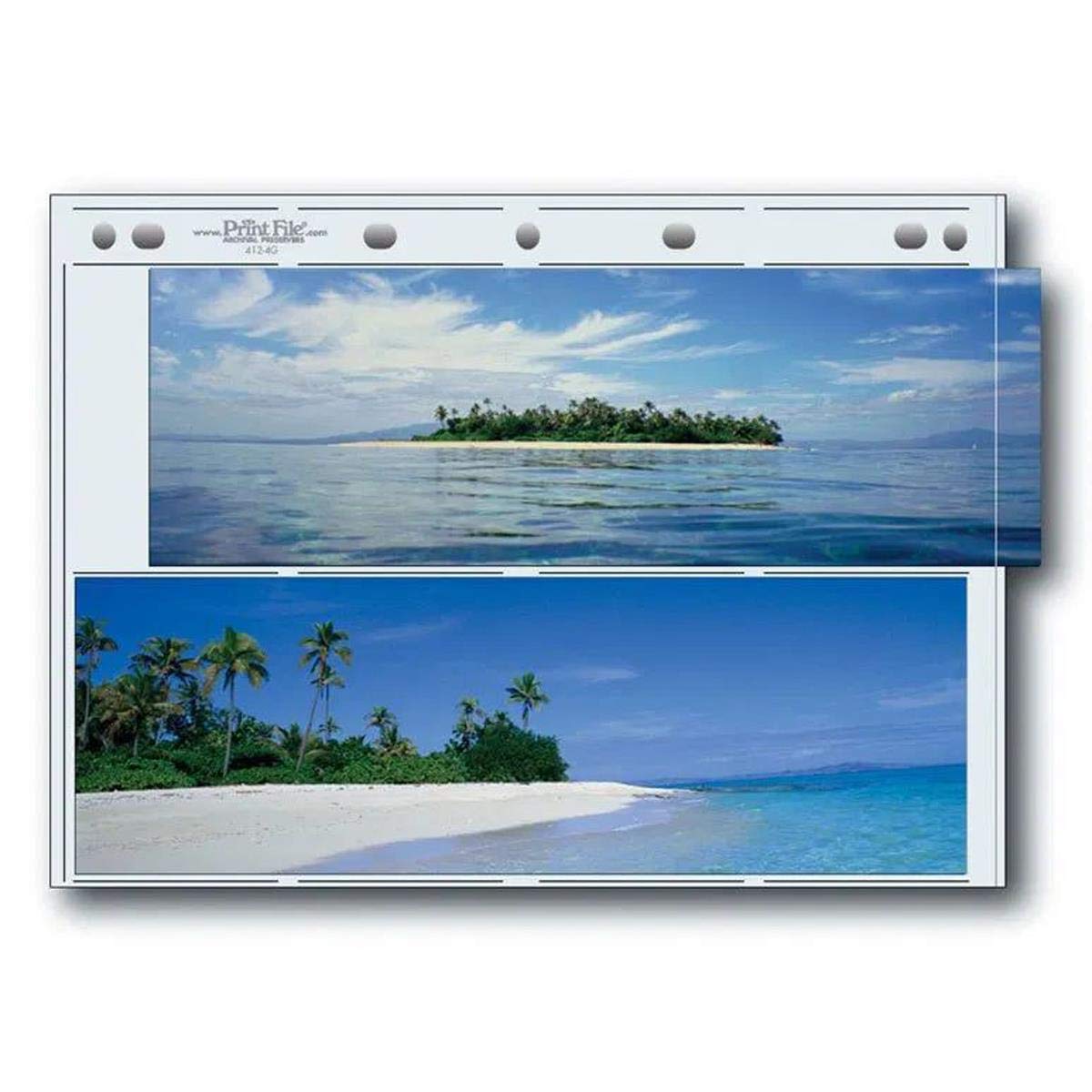
Proper handling is crucial. Fingerprints, scuffs, dust, and corner damage can undermine an otherwise excellent presentation. Use archival sleeves or storage pages for loose prints, especially when organizing multiple submissions, alternates, or portfolio pieces. Archival storage helps preserve the surface and keeps work protected during transport and review preparation.
A useful option for print organization is the Print File Premium Series-G Archival Storage Page, which helps photographers store and separate prints more safely as they prepare submissions and maintain their finished work.
Should I test print before making the final contest submission?
Yes, absolutely. Test prints are one of the most effective ways to improve a competition entry. They let you inspect sharpness, color, tonal range, cropping, border choices, and paper behavior before committing to the final version. Even experienced printers benefit from seeing a physical draft, because prints reveal issues that are easy to miss on a monitor.
A good approach is to test the most critical areas first: skin tones, dark shadows, textured highlights, and any area with fine detail. If those zones hold together well, the final full-size print is far more likely to succeed. Small refinements made after a test print often produce the most polished final result.
What final presentation details do judges notice most?
Judges notice the complete viewing experience. They respond to the image first, but print quality, tonal control, clean borders, surface condition, mounting precision, and overall professionalism all contribute to the impression your work makes. A strong file can lose momentum if the print is sloppy, poorly trimmed, or mismatched to the paper.
Take time to inspect every final piece under good light. Look for dust, banding, uneven borders, scratches, color casts, and presentation flaws. If the print will be handled more than once before judging, store it carefully in archival protection to keep it in excellent condition.
Preparing images for print competitions is both a technical process and a presentation craft. If you are refining your print workflow, building a stronger understanding of fine art output, or organizing finished work for submission, Unique Photo has helpful resources, including printing guides and archival storage solutions, to support your next competition entry.