Epson SureColor P5370 vs. Kodak Kodacolor 200: The Color-Managed Landscape Workflow Showdown
Landscape photographers are passionate about accurate, natural color — from subtle dawn pastels to saturated alpine greens. In this head-to-head, we compare two popular routes to faithful color: a modern, fully color-managed digital print workflow built around the Epson SureColor P5370, and a film-first approach with Kodak Kodacolor 200. Along the way, we share practical tips for calibration, soft proofing, and troubleshooting common issues so your prints look the way your scene felt.
Side-by-Side Specs
| Spec | Epson SureColor P5370 (Digital Print Workflow) | Kodak Kodacolor 200 (Film-First Workflow) |
|---|---|---|
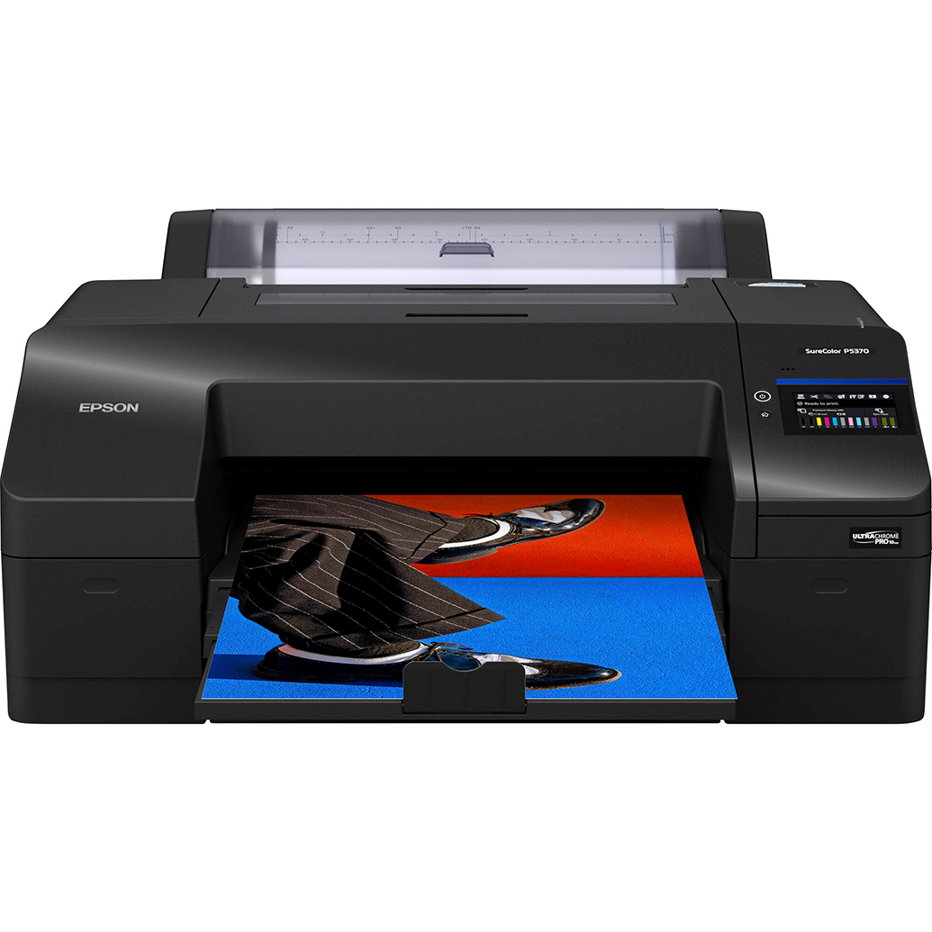
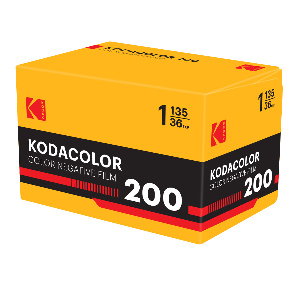
| Type | 17-inch professional photographic printer | 35mm color negative film |
| Speed/Throughput | On-demand prints; time varies by size/quality | Capture → develop → scan/print via lab or home workflow |
| Color Control | ICC profile-driven from edit to print; soft proofing | Film palette + lab/scanner color; profile control depends on lab |
| Calibration Needs | Calibrated/characterized display; correct printer/paper profiles | Consistent lab process; scanner settings or lab-provided profiles |
| Output Medium | Fine art and photo papers (cut or roll) | Digital scans and lab prints; darkroom optional |
| Ideal Use | Precise, repeatable color-managed fine art prints | Nostalgic color with pleasing contrast and grain |
| Learning Curve | Moderate: profiles, rendering intents, soft proofing | Moderate: film exposure, lab communication, scan adjustments |
Category-by-Category Analysis
Color accuracy in skies, foliage, and neutrals
The Epson P5370 path excels when your goal is color fidelity across the full landscape palette. With a calibrated display and the correct ICC profile for your chosen paper, you can tune subtle sky gradients and complex greens, then reproduce them consistently on paper. Kodacolor 200 leans into a familiar, friendly color response; it can render greens and skin tones with appealing warmth, though exact neutrality depends on the lab process and scan.
- Tip (Digital): Set your monitor around 80–120 cd/m² brightness, D65 white point, and a common gamma (2.2) to reduce prints that feel too dark or cool.
- Tip (Film): Ask your lab for “neutral scans” with no heavy auto-color, or request a consistent scanner preset you like. Keep a sample frame as a reference.
Gamut, tonality, and highlight roll-off
With the P5370 and a quality matte or luster paper, you can target a wide, smooth tonal scale and protect delicate highlights through soft proofing. Film’s highlight handling is naturally graceful; Kodacolor’s curve can produce pleasing roll-off in bright clouds, though dense shadows may require careful scanning to maintain detail.
Workflow control and calibration
Digital printing offers full end-to-end control:
- Use the correct paper ICC profile in your editor and enable soft proofing to preview gamut limits.
- Avoid double-profiling: either let the application manage color with the paper profile or let the printer manage color — not both.
- Rendering intents: Relative Colorimetric preserves neutrals; Perceptual can smooth gamut compression for saturated foliage and sunsets.
Film-first control hinges on consistent processing and scanning:
- Communicate with your lab about your color target (neutral vs. warm). Request consistent scanner settings or a reference profile if available.
- When editing scans, treat them like a different "camera profile" — correct the orange mask, set a neutral point, then fine-tune saturation and hue.
Troubleshooting common calibration issues
- Prints too dark: Your display is likely too bright. Re-calibrate and re-soft-proof; consider a slightly higher print brightness curve for matte papers.
- Unexpected color cast: Verify white balance in raw, confirm paper ICC and printer driver settings, and check for mixed lighting in your workspace.
- Banding or blotchy gradients: In digital, increase print quality and ensure the correct media type. In scans, request higher-bit-depth scans from your lab.
- Greens look unnatural: Reduce global saturation; target selective HSL adjustments. In scans, ask the lab to avoid aggressive saturation boosts.
Consistency and repeatability
For series work, the P5370’s repeatability is a standout: once your monitor and printer/paper profile are dialed in, you can reproduce a portfolio with minimal drift. Kodacolor 200 consistency depends on film batch, processing chemistry, and scanner profiles, so expect a touch more variation frame to frame or from lab to lab — part of its charm for some artists.
Editing latitude
Digital raw files + P5370 provide broad latitude for precise hue shifts and local adjustments before a proofing pass. Film scans also edit well, but large corrections can reveal noise or color crossover depending on scan quality and exposure.
Cost and time
Digital printing centralizes costs in paper and ink, but saves time with on-demand proofing and iteration. Film adds ongoing costs (rolls, development, and scanning) and time between capture and final print; worthwhile if you love its native aesthetic.
Paper choice matters: pairing the P5370 with fine art media
Paper selection is your final color and contrast “dial.” A textured matte stock can make subtle, natural color sing in landscapes.
- Use the exact ICC profile for your paper and set the matching media type in the driver.
- Soft proof with paper white simulation to anticipate dMax and contrast on matte stocks.
Sharpen your skills with targeted education
Color management is part capture, part edit. These Unique University classes help at both ends of the workflow:


- Editing and Enhancing Landscape and Nature Photography with Photoshop: Build a consistent editing pipeline, soft proof effectively, and prepare files for print with predictable color.
- Macro and Landscape Photography at Duke Farms with Michael Downey: Nail exposure and white balance in the field, reducing color correction later.
Our Pick
Epson SureColor P5370 — For landscape photographers who prioritize precise, repeatable, and neutral color from screen to print, the P5370-based workflow offers the most control and the most predictable results. Pair it with a calibrated monitor, proper ICC profiles, and a fine art paper to achieve museum-quality, natural color. Kodacolor 200 remains a beautiful choice when you want an organically warm palette and film character, accepting a bit more variability as part of the look.
Conclusion
Whether you choose the exacting control of a calibrated digital print workflow or the classic character of color negative film, Unique Photo has you covered with printers, papers, film, and classes to refine your craft. Visit Unique Photo to build a color workflow that keeps your landscapes looking true to life.